How to Design a Good Label for Your Energy Drink: Effective Elements to Include
Creating an effective label for your powdered energy drink is essential to your product's success. Nielsen reports that 64% of consumers try new products based on packaging alone.
The U.S. energy drink market exceeded $19 billion in 2023, with powdered formats gaining popularity for their convenience and shelf life. Your label becomes your first and most powerful marketing tool in such a competitive space.
If you're learning how to design a good label for your energy drink, focus on clearly communicating your value. A strong design can mean the difference between becoming a top seller and being overlooked entirely.
Key Elements of an Effective Energy Drink Label

When designing a powdered energy drink label, some components are absolutely essential.
A successful label balances legal compliance with brand appeal, all while making it obvious what sets your product apart from the rest.
Regulatory Requirements
Before jumping into the creative process, you need to understand the mandatory elements required on all powdered energy drink labels:
- Product name: Must be prominently displayed and align with your brand identity
- Net quantity: Clearly state the total weight (typically in grams or ounces) and the number of servings per container
- Ingredient list: List all ingredients in descending order by weight
- Nutritional information: Include details like calories, caffeine per serving, sugar content, and other key nutrients
- Manufacturer information: Your company’s name and contact details
- Allergen warnings: Identify any potential allergens clearly and prominently
- Cautionary statements: Highlight any warnings about caffeine levels and suggested daily intake, especially important for powdered formats that are mixed by the consumer
Because your product is not sold as a ready-to-drink beverage, it's especially important to include clear mixing instructions and serving size recommendations.
Also, ensure full compliance with FDA (or relevant regulatory body) guidelines to avoid costly labeling errors or recalls.
Brand Identity Elements
Beyond the legal must-haves, your label also serves as a storytelling tool. It should showcase your brand’s personality and instantly resonate with your target market:
- Logo: Make it clear, distinctive, and scaled appropriately to the package size
- Color scheme: Use colors that reflect your brand’s tone—whether that’s bold and high-energy or clean and health-focused
- Typography: Choose fonts that are both readable and representative of your brand’s voice
- Unique selling proposition: Is your product sugar-free? Formulated for gamers? Packed with adaptogens? Whatever sets it apart should be front and center.
- Target audience indicators: Use visual cues and messaging that speak directly to your ideal customer, whether they’re athletes, students, busy professionals, or fitness enthusiasts
Remember, powdered energy drinks often sit on shelves next to supplements, pre-workouts, or hydration mixes, not just canned energy drinks.
Your label needs to compete in that space while still making it clear this is a powerful, energizing product.
Designing for Your Target Market
Understanding your target demographic is essential when creating a label for your powdered energy drink.
Your packaging has to do more than inform—it needs to attract attention and connect with your ideal customer in a matter of seconds, both online and on store shelves.
Demographic Considerations
Different age groups and consumer segments respond to very different design cues, especially in the powdered supplement and performance nutrition space:
18–24 Market
This younger demographic typically gravitates toward energetic, eye-catching visuals and modern design language. Effective design elements include:
- Bold, intense color schemes with strong contrast
- Trendy, edgy typography that reflects digital and gaming culture
- Visually dynamic designs that pop on social media and e-commerce listings
- Nods to internet trends, music, gaming, or pop culture
25–35 Market
This audience is still energized but is beginning to seek a blend of style and substance. They value aesthetics that feel more intentional and premium:
- Balanced layouts with intentional white space
- Premium textures or finishes on packaging (for example, matte pouches with gloss highlights)
- Sophisticated fonts that are still easy to read
- Clear labeling of functional benefits like sustained energy, no crash, or hydration support
Health-Conscious Consumers
If your powdered energy drink targets wellness-minded users—think gym-goers, biohackers, or natural health enthusiasts—then your label should reflect that:
- Clean, minimalist layouts that suggest transparency and purity
- Earth-tone or nature-inspired color palettes
- Emphasis on natural ingredients and benefits (e.g., green tea extract, adaptogens)
- Labels that highlight attributes like “sugar-free,” “vegan,” “non-GMO,” or “keto-friendly”
- A softer design language—fewer lightning bolts, more clean icons and ingredient imagery
Identifying your primary and secondary demographics will help you zero in on the label design decisions that resonate most effectively with the people you're trying to reach.
Color Psychology for Energy Drink Labels
Color plays a powerful role in how your powdered energy drink is perceived. It instantly communicates mood, function, and flavor before a word is even read.
Strategic Color Selection
- Red: Signals power, urgency, and high energy—perfect for high-stim or pre-workout style products. Also commonly linked to berry or cherry flavors.
- Yellow/Orange: Feels warm, bright, and energizing. These shades imply citrus flavors and mental uplift—great for morning or “focus” blends.
- Blue: Suggests coolness, calm energy, and mental clarity. Blue works especially well for nootropic or clean-energy formulas.
- Black: Conveys strength, authority, and premium quality. Works well for advanced or high-performance blends when paired with neon or metallic accents.
- Green: Reflects nature, health, and sustainability. Ideal for plant-based, adaptogenic, or naturally-sourced energy powders.
- White: Clean, simple, and modern. A white-dominant label can give your product a "clean energy" vibe and help highlight key claims or benefits.
Pro tip: Don’t feel locked into one color. A smart color hierarchy—like using green for wellness and red for energy—lets you appeal to multiple instincts and use visual storytelling to your advantage.
Typography That Communicates Energy
Font selection plays a major role in how consumers interpret your powdered energy drink’s vibe—whether it screams high-performance intensity, laser focus, or clean, natural energy.
The right typefaces help communicate not just what your product does, but who it’s for.
Font Selection Strategies
For High-Energy Products:
If your powder is positioned as a performance booster or workout pre-mix, your fonts should match that intensity.
- Bold, condensed sans-serif fonts that demand attention
- Sharp, angular letterforms for a dynamic, high-octane feel
- All-uppercase or mixed-case with aggressive styling
- Italicized or slanted text to convey motion and speed
For Focus/Performance Products:
For blends targeting mental clarity, productivity, or esports performance:
- Clean, geometric sans-serif fonts that feel modern and sharp
- Consistent letter spacing and weight for readability
- Strategic contrast using thin and bold weights for hierarchy
- High-tech numerals for ingredients or caffeine dosage
For Natural/Organic Energy Drinks:
If your powdered energy product leans into wellness or plant-based benefits:
- Softer, rounded sans-serif fonts feel more natural and approachable
- Occasional script or handwritten-style elements for an organic touch
- Generous spacing and proper capitalization for a calmer, more relaxed tone
- Mixed case is less aggressive than all-caps styles
Pro tip: Readability always comes first. Even the most creative font choices should be legible at a glance, especially online, where customers scroll fast and scan labels.
Creating Visual Hierarchy

An intentional visual hierarchy helps guide the consumer’s eye, making sure the most important selling points of your powdered energy drink stand out right away.
Prioritizing Information
Structure your label in a way that mirrors how customers evaluate a product:
- Brand/Product Name – The most prominent element, bold and visible at a glance
- Flavor/Variant – Clear and easy to differentiate across SKUs (e.g., "Tropical Rush" or "Lemon Chill")
- Key Benefit/USP – What sets your powder apart? (e.g., “Clean Energy + Electrolytes” or “No Crash Formula”)
- Supporting Benefits – Secondary features like “Adaptogen-Infused,” “Vegan,” or “Hydration Support”
- Nutritional Highlights – Key callouts such as caffeine per serving, no sugar, or vitamin content
- Regulatory Information – Serving instructions, warnings, supplement facts panel, and ingredient list
Use font size, weight, color, and spacing to visually separate each layer of importance, ensuring consumers get the message in 3–5 seconds.
Imagery and Graphic Elements
Strategic visuals on your label can instantly convey energy, intensity, and health benefits—especially in a crowded marketplace of powdered supplements and drink mixes.
Effective Visual Techniques
Energy Cues:
- Lightning bolts, kinetic lines, or pulse wave graphics to suggest power
- Abstract motion effects that create a sense of speed and vitality
- Background textures like splashes, particles, or energy fields for depth
Ingredient Visualization:
- Clean, modern illustrations of natural ingredients like matcha leaves, citrus slices, or ginseng root
- Subtle visuals hinting at the origin of ingredients (e.g., mountain imagery for clean water or purity)
- Simple icons representing core benefits like focus, hydration, or endurance
Texture and Dimension:
- Packaging finishes like matte pouches with spot gloss accents or metallic foil for logo highlights
- Visual design cues that imply refreshment, such as ice textures or condensation graphics
- Layered backgrounds that create depth and emphasize the premium feel
Just like with typography, less is more. One strong visual concept backed by a few supporting elements is often more effective than a chaotic label filled with competing graphics.
Material Selection and Special Finishes
The material and finishes you choose for your powdered energy drink label will significantly influence how consumers perceive the product’s quality and its shelf presence.
These physical attributes are key to standing out and creating a memorable first impression.
Label Materials and Techniques
Material Options:
- Pressure-sensitive paper labels: Cost-effective but with limited durability, these work well for smaller runs or less premium products.
- Synthetic films: Offer water resistance, flexibility, and a premium appearance, making them ideal for higher-end products or those that need to withstand rough handling.
- Shrink sleeves: Perfect for maximum design area, these labels contour directly to your packaging shape, offering full coverage and a seamless look.
- Direct printing: A great option for high-volume products, giving a clean, premium look, especially for single-serve packets of powder or bulk bags.
Specialty Finishes:
- Selective spot gloss: Used to highlight specific elements of the label, adding a touch of sophistication and visual contrast.
- Metallic foils: Often used to evoke a high-end feel, metallic finishes can create a premium perception that appeals to consumers looking for something special.
- Embossing/debossing: Adds a tactile element, making your label stand out both visually and physically, especially useful for powders targeting premium or high-performance markets.
- Soft-touch coatings: These finishes give a velvety, smooth feel, enhancing the premium experience for customers when they hold your product.
- Thermochromic inks: These inks change color when exposed to temperature changes, which can be a fun, interactive element—great for products marketed as cooling or refreshing.
While these specialty finishes can increase your production costs, they can also dramatically boost perceived value, helping justify a higher price point.
Think carefully about how these finishes align with your brand and product positioning before committing.
Testing Your Label Design
Before finalizing your powdered energy drink label, it’s essential to ensure it performs well in real-world scenarios and across digital platforms.
Evaluation Techniques
Shelf Testing:
- Display your product alongside competitors in a mock retail setup.
- Evaluate visibility and attractiveness from typical shopping distances (3-6 feet).
- Test how your label looks under various lighting conditions (e.g., bright overhead lighting vs. ambient store lighting).
Digital Presence Check:
- Examine how your label appears in small thumbnails on e-commerce sites.
- Ensure that key details (such as the product name and key benefits) are visible on mobile devices.
- Confirm that text and graphics remain readable and impactful in compressed digital formats.
Consumer Feedback:
- Conduct focus groups with individuals who match your target demographic.
- Use A/B testing with different label design variations to see which one resonates most with your audience.
- Gather feedback specifically on message clarity—ensure your label communicates the key selling points effectively.
By making adjustments based on these tests, you can avoid costly design mistakes and create a label that performs well both in physical stores and online.
Common Energy Drink Label Design Mistakes
Watch out for these common pitfalls that can undermine the effectiveness of your powdered energy drink label:
Design Errors to Avoid
- Overcrowding: Cramming too much information into your design can make it difficult to read, reducing its visual impact.
- Poor contrast: Color combinations that reduce legibility can make your label hard to read at a glance.
- Inconsistent branding: Failing to align your label with the rest of your marketing materials can confuse consumers and dilute your brand identity.
- Generic design: Creating a label that looks too similar to your competitors can make your product blend in rather than stand out.
- Regulatory oversights: Missing required elements (like ingredient lists or warnings) or making unsubstantiated claims can result in costly fines or recalls.
- Illegible small text: Using fonts that are too small or intricate for legal information can make it difficult for consumers to understand your product details.
- Ignoring scalability: A label design that looks great on one container size might not work well on others, so ensure your design scales appropriately for different packaging formats (e.g., single-serving packets vs. bulk bags).
For additional inspiration and guidance, explore label design examples from health and wellness products that successfully balance information and aesthetic appeal.
Practical Production Considerations
Understanding the practical side of label production ensures that your powdered energy drink’s packaging process goes smoothly and cost-effectively.
Manufacturing Realities
Printing Specifications:
- Color systems: Decide between CMYK (full-color printing) or PMS (Pantone Matching System) depending on your desired look.
- Resolution requirements: Ensure your files meet a minimum of 300 DPI for sharp, professional-quality print.
- Bleed and safety margins: Keep about 1/8 inch of bleed around the edges of your design to prevent cutting issues during production.
- Barcode placement: Ensure proper placement and formatting of barcodes for scanning at the register.
Production Timeline:
- Design revisions: Typically 2–4 weeks for revisions and final approval.
- Regulatory review: Allow 1–2 weeks for necessary compliance checks.
- Printing production: This typically takes 2–4 weeks, depending on the volume and complexity of your design.
- Packaging application: This step’s timeline depends on the method of application used (e.g., pressure-sensitive labels vs. shrink sleeves).
Cost Factors:
- The number of colors used in your design.
- Specialty finishes like embossing or metallic foils.
- Material choice and label type.
- Order quantity: Larger runs often bring down the per-unit cost.
- Application method: Different methods of attaching labels to your packaging can impact cost.
Working with an experienced label manufacturer who understands the unique needs of powdered beverage products can help ensure everything from compliance to cost-efficiency.
If you're seeking a streamlined solution, consider working with private label fulfillment services that can handle both design and production processes.
Maximizing Your Label's Marketing Potential
Your powdered energy drink’s label should be the foundation for a cohesive and compelling brand presence across all platforms.
- Social Media Integration: Design with "Instagram-worthy" visual elements that encourage sharing. Bold colors, dynamic design elements, and product benefits should stand out, encouraging consumers to post and share their experiences online.
- Website Consistency: Ensure your digital presence matches your physical product design. Consistency across both your website and label helps create a seamless brand experience and reinforces brand recognition.
- Marketing Materials: Extend label elements to other marketing materials, such as trade show booths, promotional items, and advertising. By using consistent fonts, colors, and visuals, you reinforce your brand message and ensure recognition across all channels.
- Packaging Synergy: Align the individual design of your powdered energy drink packets with multi-pack and display packaging. Packaging should work together to present a unified brand look, ensuring that your design looks cohesive whether displayed as single-serve packets or bulk packages.
Expert Insights for Maximum Label Impact
A strong design sets your energy drink apart. Nielsen reports that 64% of consumers try new products based on packaging, making it a powerful marketing tool.
The U.S. energy drink market hit $19 billion in 2023, with powdered formats gaining popularity. With fierce competition, your label must be both compliant and attention-grabbing.
Balance compliance with creativity for maximum appeal. Use clear typography, a strong logo, and vibrant colors that reflect your brand’s personality.
For gamers or athletes, bold visuals and modern fonts resonate with the target demographic. A captivating label helps your powdered energy drink stand out online and on shelves.
Powering Up Your Brand: Next Steps
Designing an effective label for your powdered energy drink requires balancing creativity, marketing, and regulatory compliance.
A great design captures attention, communicates your brand’s value, and differentiates your product in a competitive market.
Your label is often the first opportunity to make an impression, so invest time and resources to get it right. If needed, seek professional design help to create a label that complements your product.
The information provided in this article is meant for general informational purposes only and should not be considered as professional or legal advice. We do not guarantee the completeness, accuracy, reliability, or suitability of the information in this article. We strongly recommend seeking professional guidance that suits your individual circumstances.
FAQ

Related blogs
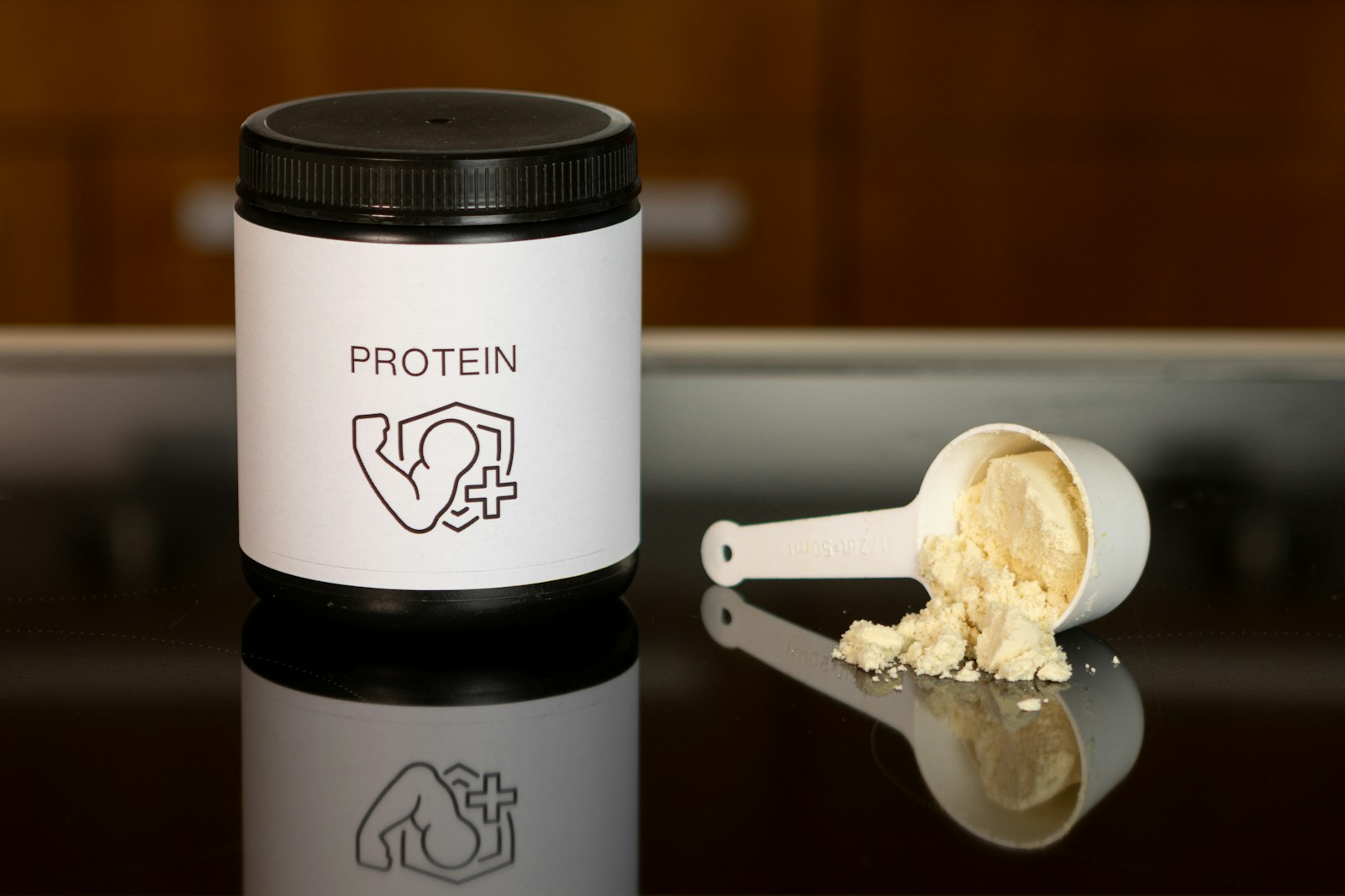
Best Protein Supplement Companies for Private Label (2026)
.avif)
Stay Ahead of the Curve: Top Supplement Trends to Watch and Sell