How to Design a Good Label for Your Supplements? Essential Elements to Maximize
In the competitive health market, a standout supplement label is key to success. Research shows that 75% of consumers judge a product by its packaging, making design crucial.
Knowing how to design a good label for your supplements grabs attention while communicating key information like ingredients, dosage, and benefits.
An effective label also ensures regulatory compliance and reinforces your brand’s identity. It builds trust with consumers and helps differentiate your product from competitors.
3 Essential Elements to Use when Designing a Good Label for Supplements
Designing a good supplement label requires balancing several critical components. First and foremost, your label must be FDA-compliant, including all required information such as supplement facts, ingredients, serving size, and appropriate disclaimers.
Beyond compliance, your label needs to effectively communicate your brand's story and value proposition while capturing attention in a crowded marketplace.
The most successful supplement labels incorporate these essential elements:
Clear Brand Identity
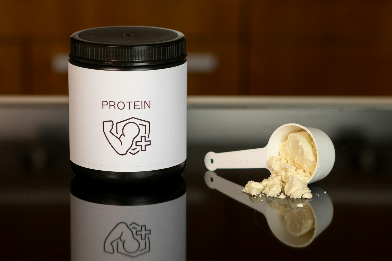
Your supplement label should instantly communicate who you are as a brand. This means the consistent use of your logo, brand colors, typography, and visual elements that align with your overall brand strategy. When customers recognize your brand at a glance, you've already won half the battle.
For new supplement brands, establishing a cohesive visual identity across all products helps build recognition and trust. Consider how your brand colors evoke specific emotions or associations relevant to your supplements' benefits.
For example, green often signals natural ingredients, while blue suggests calmness or purity.
Strategic Color Psychology
Colors significantly impact consumer perceptions and purchasing decisions. When designing supplement labels, consider these common color associations:
- Green: Natural, organic, plant-based
- Blue: Clean, pure, science-backed
- Black: Premium, luxury, high-performance
- White: Simple, pure, minimalist
- Orange/Yellow: Energy, vitality, optimism
- Purple: Calming, anti-aging, wisdom
Selecting the right color palette depends on your target audience and product positioning. A pre-workout supplement might leverage energetic reds and blacks, while a sleep aid might use calming purples and blues.
Typography That Communicates
Font selection goes beyond aesthetic preferences—it communicates critical information about your brand personality. Serif fonts (with small decorative lines) often convey tradition, reliability, and established expertise. Sans-serif fonts (without decorative lines) project modernity, cleanliness, and accessibility.
For supplement labels, legibility should always be the priority, especially for ingredient lists and dosage information. Effective designs typically use:
- Bold, clear fonts for product names
- Clean, readable fonts for ingredient lists
- Strategic font hierarchy to guide the eye to key information
Pro tip: Limit your label design to 2-3 font families to maintain a clean, professional appearance. Too many fonts create visual confusion and can make your product appear unprofessional.
Regulatory Compliance Requirements for Supplement Labels

Compliance with FDA regulations isn't optional—it's mandatory for legally selling supplements in the United States. Your label must include:
Required Information Panel Elements
- Product identity statement (what the product is)
- Net quantity of contents
- Nutrition Facts or Supplement Facts panel
- Ingredient list including all ingredients
- Name and address of manufacturer, packer, or distributor
- Warning statements (if applicable)
- Directions for use
- "Dietary Supplement" statement
Supplement Facts Panel Requirements
This standardized panel must contain:
- Serving size and servings per container
- Amount per serving of each dietary ingredient
- Percent Daily Value (%DV) when established
- Ingredients without established Daily Values listed by weight
- "Daily Value not established" statement where applicable
Compliance failures can lead to costly recalls, legal issues, and damage to your brand reputation.
Design Principles for Effective Supplement Labels
Beyond meeting regulatory requirements, your supplement label needs to stand out and communicate effectively. Consider these design principles:
Visual Hierarchy
Guide consumers' eyes to the most important information first by using size, color, and spacing strategically. Typically, the visual journey should follow:
- Brand name/logo
- Product name
- Key benefit callout
- Supporting information
- Regulatory details
Effective supplement labels use contrast, size differences, and white space to create this natural flow of information. The elements customers care most about—what the product is and what it does—should be immediately apparent.
Balancing Information and White Space
One common mistake in supplement label design is overcrowding. While you must include required information, cluttered labels overwhelm consumers and appear unprofessional. The strategic use of white space (empty areas) allows the eye to rest and helps key information stand out.
Consider the "less is more" approach for the primary display panel, highlighting only the most compelling selling points. Additional information can be included on secondary panels or through QR codes linking to detailed product information online.
Imagery and Iconography
Well-chosen images and icons can instantly communicate key product benefits or ingredients. For example:
- Clean ingredient icons for gluten-free, non-GMO, or organic certifications
- Simplified illustrations of key botanical ingredients
- Abstract representations of benefits (e.g., brain icon for cognitive supplements)
Whatever imagery you choose, ensure it's high-resolution and professionally executed. Low-quality images or clipart can significantly undermine perceived product quality.
Tools and Resources for Creating Professional Labels
You don't need to be a professional designer to create effective supplement labels. Several resources can help:
Design Software Options
- Adobe Illustrator: Professional-grade vector design software (learning curve required)
- Canva: User-friendly design platform with supplement label templates
- Affinity Designer: One-time purchase alternative to Adobe with professional capabilities
Working with Professional Designers
For many supplement brands, investing in professional design services provides the best return. Professional designers understand both the aesthetic and regulatory considerations specific to supplement packaging. Find designers with experience in the supplement industry through:
- Freelance platforms like Upwork or Fiverr
- Design agencies specializing in supplement packaging
- Private label services that include label design
When working with designers, provide clear direction about your target audience, brand personality, and key selling points. The more specific your brief, the better the results.
Label Templates and Examples
Studying successful supplement labels can provide valuable inspiration. Browse through label design examples for health protein powder to understand current trends and effective approaches. Look for patterns in how successful brands communicate their value proposition while maintaining compliance.
Material and Finishing Considerations

The physical properties of your label contribute significantly to perceived value. Consider these options:
Label Material Selection
- Glossy: Provides vibrant colors and moisture resistance
- Matte: Delivers a sophisticated, premium feel
- Textured: Creates tactile interest and premium associations
- Clear: Allows the container to show through for minimalist designs
For sustainability-focused brands, recycled or biodegradable label materials align with eco-conscious consumer values.
Special Finishes
Strategic use of special finishes can elevate perceived value:
- Spot UV coating: Highlights specific areas with a glossy finish
- Foil stamping: Adds metallic accents for premium appeal
- Embossing: Creates raised texture for tactile interest
- Die cutting: Creates custom shapes for distinctive appeal
These premium finishes typically increase production costs but can significantly enhance shelf appeal and justify higher price points.
For new brands with limited budgets, the selective use of one premium finish (rather than multiple) can provide distinctive appeal without excessive costs.
Common Label Design Mistakes to Avoid
Learning from common mistakes can save time and resources:
Overcomplicated Designs
Cluttered, busy designs confuse consumers and dilute your message. Prioritize clarity and focus on communicating 1-2 key benefits prominently rather than trying to include everything.
Poor Color Contrast
Ensure text is legible against background colors. Dark text on light backgrounds (or vice versa) provides the best readability. Avoid placing text over busy patterns or images where readability suffers.
Inconsistent Branding
Your supplement labels should visually connect to your broader brand identity. Inconsistent use of logos, colors, or typography across products creates consumer confusion and weakens brand recognition.
Misleading Claims
Beyond legal implications, making exaggerated or misleading claims damages trust. Focus on truthful, substantiated benefits rather than sensational promises. Clear, honest communication builds lasting customer relationships.
Testing Your Label Design Before Production
Before committing to a large production run, test your label design:
Digital Visualization
Use mock-up templates to visualize your label on actual product containers. Review how it appears from different angles and distances to ensure key information remains visible.
Consumer Feedback
Gather feedback from your target audience through:
- Social media polls showing design options
- Small focus groups with potential customers
- A/B testing different designs in digital advertising
Pay attention to initial impressions, what information stands out, and whether your design communicates the intended product benefits.
Printing Test Samples
Request small batch samples from your printer before committing to a full production run. Physical samples allow you to:
- Verify color accuracy
- Check legibility of small text
- Test how labels apply to your containers
- Evaluate overall quality and impact
This small upfront investment prevents costly mistakes in large production runs.
Adapting Your Label Design for Different Products and Formats

As your supplement line grows, maintain brand consistency while distinguishing between products:
Product Line Consistency
Create a cohesive system that maintains brand identity while differentiating between products. Consider:
- Consistent placement of brand elements
- Color-coding system for different product categories
- Standardized information hierarchy
This approach helps customers quickly find their preferred products while reinforcing overall brand recognition.
Sizing Adaptations
Different supplement containers require thoughtful design adaptations:
- Powder containers need large, visible labels with clear serving information
- Capsule bottles require compact information organization
- Sachets and sample packets need essential information in minimal space
Each format presents unique challenges, but maintaining consistent brand elements creates a unified product family.
Expert Insights: The Subtle Power of Negative Space in Label Design
Negative space—blank areas surrounding text and images—can elevate your label’s design. It might seem counterintuitive to leave space empty, but it helps create clarity and focus. By using it strategically, you direct attention to the most important details.
A clean, uncluttered label can evoke trust and quality, subtly influencing consumer decisions. Negative space is a powerful tool that speaks volumes, enhancing your label’s impact without overwhelming the viewer.
Your Label Design Journey Starts Now
Effective supplement labels blend art, science, and compliance. The best designs communicate brand values and stand out in crowded markets. Your label is often the first impression—make it count.
To bring your supplement brand to life, define your identity, research compliance, and explore successful designs in your niche.
Take the next step in your supplement business journey by exploring comprehensive label design services that can help translate your brand vision into compliant, eye-catching product packaging that drives sales and builds customer loyalty.
FAQ

Related blogs
Best Protein Supplement Companies for Private Label (2026)
.avif)
Stay Ahead of the Curve: Top Supplement Trends to Watch and Sell