The box your product comes in is the very first thing a customer actually touches. When you sit down to learn about design elements, consider how they affect the customer experience.
This starts the moment the package hits the porch and continues through every layer. It is much more than just sticking a logo on a cardboard box.
This guide covers the whole process, from figuring out your identity to testing your final design.
6-Step Process for Branded Packaging That Converts
Success in this area usually follows a repeatable process. You have to tie your branding development to your material and design choices. Here are six steps to help you get it right.
Step 1: Define Your Brand Identity and Packaging Goals
Before you pick out a box size or a color, you need to be clear on who you are in the brand packaging design process. Your packaging acts as a physical extension of your identity. Customers will notice if the box and the brand do not feel like they belong together.
Ask yourself these questions first in the design packaging process:
- What adjectives fit your brand? (Is it minimal, premium, or perhaps eco-conscious?)
- What does your customer expect to feel when the mail arrives?
- What is the main goal? Is it protection, brand recall, or social media shareability?
- Do you have sustainability goals that the packaging needs to show?
If you skip this part, you will likely end up redesigning the whole thing twice.
Step 2: Choose the Right Packaging Structure and Materials
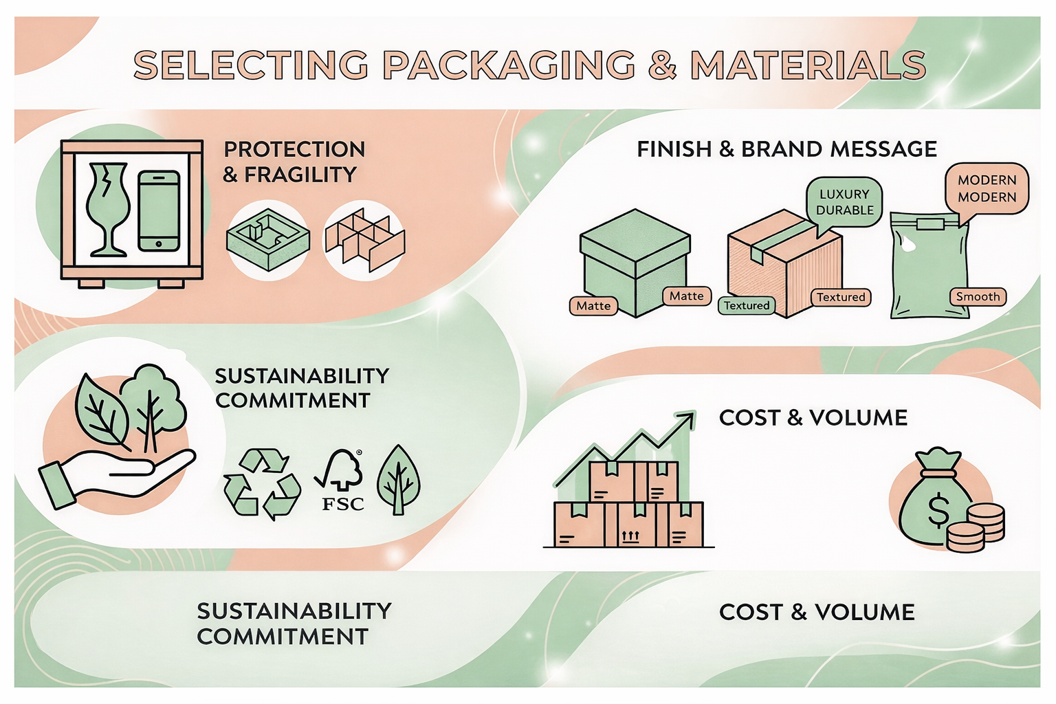
The structure and the materials are not just for function; they also create packaging that reflects your brand. They are a major part of the overall brand experience. A thick matte box feels very different compared to a simple Kraft mailer tied with a string.
Think about these factors:
- How fragile is the product? Does it need foam or dividers?
- What is the finish? Corrugated, rigid board, and poly mailers all send different messages to your target market.
- Sustainability needs. Look into recycled or FSC-certified materials.
- The cost per unit is based on how much you plan to order.
Never pick your materials without holding physical samples first. What looks good on a computer screen often feels cheap in your hands.
Step 3: Apply Your Visual Brand Elements
This is the stage where the brand design package moves from an idea to a real object. Visuals need to look clean on physical surfaces. This is often harder than it sounds.
Core elements to use:
- Logo placement: Essential in packaging design to ensure it catches the eye and reinforces brand loyalty. Put it on the lid, the top flap, or the front face.
- Brand colors: Use CMYK or Pantone instead of RGB to keep the print accurate.
- Typography: Keep your fonts consistent across every surface.
- Print method: Digital, flexographic, or offset printing will each change how the colors look.
Always ask for a printed proof before you pay for a full run. Screens and physical prints show color in different ways.
Step 4: Design the Interior and Secondary Packaging Touches
The inside of the box is what people actually photograph for social media. It is a high-return area that most brands forget about, yet it is essential to understanding what packaging a brand is at its most impactful level. It’s not just a container; it’s an experience.
Think about adding these:
- Branded tissue paper can enhance the overall packaging look and reinforce brand loyalty.
- Custom inserts to keep the product safe.
- Thank you cards can enhance the overall design process of your packaging. These really help drive repeat sales.
- QR codes that lead to your website or a loyalty program.
Being thoughtful is always better than just being expensive.
Step 5: Add Brand Messaging, Copy, and Legal Requirements
Every word written on your box is a chance to connect and align with your brand recognition. It is also a legal requirement, depending on what you sell.
- Your tagline or brand statement.
- The product name.
- Your social media handles.
- Instructions on how to use the product can enhance the customer experience.
Legal items to check:
- The country of origin.
- Lists of ingredients or materials are essential for effective packaging design.
- Safety warnings.
- Net weight or volume should be clearly stated on your effective packaging.
- Allergen warnings where they apply.
If you are not sure, talk to a compliance expert to ensure your packaging reflects the necessary standards. This is vital if you are shipping internationally.
Step 6: Test, Prototype, and Refine Before Mass Production
This is where you catch the expensive mistakes before you print 10,000 units.
Testing checklist:
- Get physical samples made with your final materials.
- Send test units through the actual mail.
- Check all your text for typos.
- Make sure barcodes and QR codes actually scan on the box.
- Ask real customers for their feedback.
The cost of a prototype is tiny compared to a full reprint. Do not skip this step.
Why Branded Packaging Matters More Than You Think
Most online brands spend a lot on ads, but then ship their goods in plain boxes. That is a wasted opportunity at the very moment a customer is most excited.
Why is it worth the money:
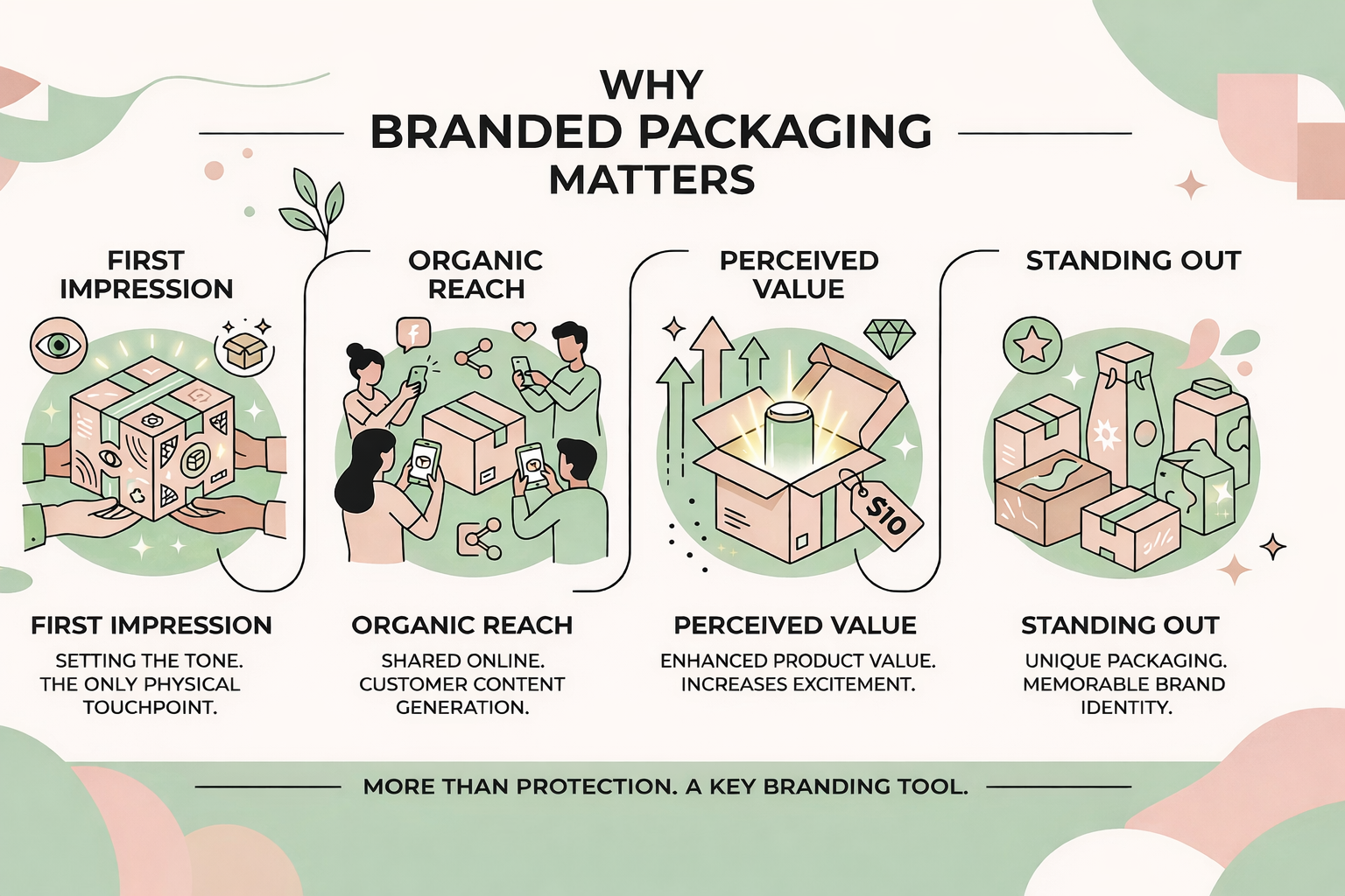
- The first impression: For many brands, the box is the only physical touchpoint. It sets the tone.
- Organic reach: Great packaging gets shared online. Boring packaging does not.
- Perceived value: Good packaging makes the product inside seem better. Cheap boxes make even great products look average.
- Standing out: In a crowded market, the box is a way to be different and create packaging that stands out on the shelf, reinforcing brand identity.
Packaging is more than just protection. It is a tool that keeps selling your brand after the purchase is over.
Types of Packaging You Can Brand
The format you pick will change your branding options. Here are common types of effective packaging design:
- Corrugated shipping boxes: These are tough, and you can print on the inside and outside.
- Rigid gift boxes: These feel premium. They are often used for jewelry or high-end clothes.
- Poly mailers: These are light and cheap. They work well for soft goods like shirts.
- Kraft paper mailers: These have an eco-friendly look that suits natural brands.
- Bags and pouches: These are common for food and beauty items.
- Custom inserts: Using tissue paper or card inserts makes the experience better.
Some brands use a branded outer box and a fancy inner box. It costs more, but it really elevates the brand and reinforces your brand identity, helping it stand out on the shelf.
Branded Packaging Design Principles to Follow
Good design should communicate clearly, incorporate visual elements, and work well in the real world to reinforce brand loyalty.
Principles to follow:
- Consistency: Your fonts and colors must match your website exactly.
- Hierarchy: Your logo should be the most important thing.
- White space: Packaging design can help catch the eye and enhance brand recognition. If the box is too crowded, it looks cheap and can hinder brand recognition.
- Legibility: Make sure small text is easy to read on a box.
- Dieline accuracy: Crucial for creating packaging that resonates with the target market and helps the product stand out on the shelf. Use the template from the manufacturer.
The best product packaging and branding are essential design elements for a successful product launch, as they significantly influence how the product stands out on the shelf. Looks like it was done on purpose. It should look good on a phone screen and in a person's hands.
How Much Does It Cost to Brand Your Packaging?
Do not look at the total price. Look at the cost per unit.
General prices:
- Custom poly mailers: $0.30 to $1.50 per unit is a reasonable budget for custom packaging.
- Custom corrugated boxes: $0.80 to $2.50 per unit.
- Premium rigid boxes: $3 to $10 or more.
- Branded tissue paper: $0.10 to $0.40 per sheet.
Costs go up if you use more colors or need the boxes quickly. For new brands, a custom mailer with a nice insert is the best place to start.
Branded Packaging Mistakes That Hurt Your Business
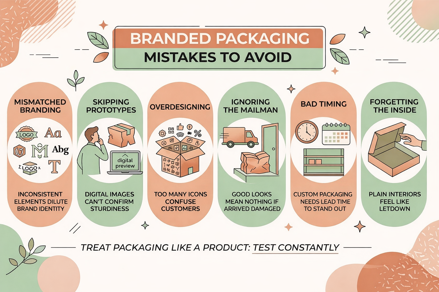
Most errors happen because people move too fast. Avoid these:
- Mismatched branding: Using different logos or fonts on different boxes can dilute the brand and affect how well it stands out in marketing materials.
- Skipping the prototype: A digital image cannot tell you if the box is sturdy.
- Overdesigning: Too many icons can confuse the customer.
- Ignoring the mailman: If the box looks good but arrives crushed, you failed.
- Bad timing: Affects how your product stands out on the shelf. Custom boxes can take two months to arrive, but their packaging looks exceptional and can reinforce brand identity.
- Forgetting the inside: A plain brown interior feels like a letdown.
The best brands treat their packaging like a product that needs constant testing.
Branded Packaging Examples and Inspiration by Industry
Finding the right look for your specific market ensures your package design actually hits home with your audience. Here is a quick look at how different industries use their packaging brand to stand out and connect.
- Skincare: Rigid boxes with soft finishes and foil logos.
- Apparel: Packaging materials should reflect the quality of the products inside. Printed poly mailers with branded tissue and thank you cards.
- Food: Kraft paper with clear messages about being eco-friendly.
- Electronics: Packaging reflects the quality of the product and should catch the eye of consumers. Sleek boxes with custom foam to keep parts safe reflect your brand's commitment to quality.
The goal is to make the packaging feel like a part of the brand.
What Information Is Legally Required on Product Packaging?
Most places require a few basic things on every box.
Common requirements:
- The product name.
- Where it was made can enhance the brand story and connect with the target market.
- The weight or volume.
- The address of the maker is an important part of product packaging design.
- Ingredients for food or makeup.
- Safety warnings and barcodes.
Requirements change by country. Talk to a pro if you sell in different parts of the world.
Ready to Make Your Packaging Unforgettable?
Packaging is a touchpoint that a customer can actually hold, enhancing their overall customer experience. It stays in the mind longer than a digital ad.
Use this guide to start your packaging design journey. Define your brand, pick your materials, and test everything before you scale. That is how you win.
FAQ
People judge the quality before they even see the product. The weight and the finish of the box signal what kind of brand you are. Good packaging builds trust.
You need both. If a product is fragile, function comes first. If it is clothes, you can focus on looks. But a crushed box is always a bad look and can negatively impact your brand story.
Primary is what touches the product, like a bottle. Secondary is the outer box used for shipping, which is a vital part of custom packaging. Both should represent your brand.
A good rule is 5 to 10 percent of your product cost for packaging materials. Start small with inserts and work your way up to custom boxes as you grow.
Related blogs
.avif)
Stay Ahead of the Curve: Top Supplement Trends to Watch and Sell
